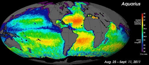
Aquarius produced this map of global ocean salinity. It is a composite of the first two and a half weeks of data. Yellow and red represent areas of higher salinity, with blues and purples indicating areas of lower salinity.
Page Six Vol. 124 SDSTA
1, 2, 3, 4, 5, 6, 7, 8